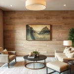
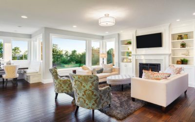
Consistent interior paint colors help create visual flow between rooms, making a home feel more coordinated without requiring every space to look identical. By choosing complementary shades and considering how rooms connect, homeowners can create a cohesive design that reflects their style while allowing each space to serve its own purpose.
In Glendale, AZ, homes can feature open-concept layouts, separate living areas, and transitions between traditional and contemporary spaces. A thoughtful color palette helps bring these areas together while accounting for natural light, existing materials, and the way each room is used.
How Do Consistent Paint Colors Improve the Flow Between Rooms?
Interior paint colors influence how people perceive the relationship between spaces. When adjoining rooms have colors with compatible undertones, the transition between them often feels more natural.
For example, a warm neutral in a living room can work alongside a slightly deeper beige in a dining area. The colors remain distinct, but their shared undertones help create continuity.
Should Every Room Have the Same Interior Paint Color?
Using one color throughout a home can create a simple, unified appearance, but it is not the only way to achieve a cohesive design. Different rooms have different lighting conditions, functions, and design requirements.
A coordinated palette allows homeowners to introduce variety without making the overall design feel disconnected.
Consider these approaches:
- Use a shared base color: A consistent neutral can connect hallways, living areas, and other common spaces.
- Introduce related shades: Lighter or darker versions of a similar color can distinguish rooms while maintaining continuity.
- Repeat selected colors: Using an accent color in more than one room can create subtle connections.
- Consider transitions: Colors should work together where rooms meet, even when their lighting differs.
The goal is to create a relationship between colors rather than enforce a single rule for every room.
How Can Homeowners Choose a Cohesive Interior Color Palette?
A successful palette begins with the elements that will remain in the home. Flooring, cabinetry, countertops, furniture, and other permanent or prominent features can influence which paint colors look appropriate.
Start With Existing Materials
Wood flooring, stone surfaces, countertops, and cabinetry often have noticeable undertones. Some lean warm, while others appear cooler or more neutral.
Identifying these undertones before choosing paint helps prevent colors from clashing with existing materials.
Select a Dominant Color Family
Choosing a general color direction helps narrow the options. Homeowners might prefer warm neutrals, cool grays, muted greens, or earthy shades.
A consistent color family can connect rooms even when individual shades vary.
Test Colors in Their Actual Rooms
Paint samples can look different depending on window direction, daylight intensity, and artificial lighting. A shade that appears balanced in one room may look noticeably warmer or cooler in another.
How Does Natural Lighting Affect a Consistent Color Palette?
Lighting is one reason a single paint color may appear different throughout a home. Rooms with large windows may receive abundant daylight, while interior hallways or shaded bedrooms may remain relatively dim.
In Glendale, AZ, strong sunlight can make some colors appear brighter or more intense during parts of the day. Window orientation, exterior shade, and window coverings also affect how much light reaches interior surfaces.
When selecting colors for connected rooms, homeowners should evaluate samples at different times of day.
A useful approach is to check:
- How the color looks in morning light.
- Whether afternoon sunlight changes its warmth or intensity.
- How the shade appears under the home’s usual evening lighting.
- Whether adjacent colors still complement each other when lighting conditions differ.
These comparisons can help homeowners maintain visual continuity without expecting every room to display identical color characteristics.
How Can Different Paint Shades Define Individual Spaces?
A connected design can include subtle changes in color that help distinguish rooms according to their purpose.
For example, an open living and dining area might use a light neutral as its main color, with a slightly deeper shade in the dining space. A home office could feature a muted accent color while retaining the same overall palette.
What Role Do Professional Interior Painting Services Play in Color Consistency?
A coordinated color palette needs careful execution to achieve the intended appearance. Differences in surface condition, paint application, and finish can affect how colors look across adjoining rooms.
Crafted Painting and Fine Finishes serves homeowners in Glendale, AZ, with residential painting solutions. They can help homeowners consider their interior spaces and painting requirements when planning an update. Homeowners exploring their options can learn more from Local Interior Painters.
When planning an interior project, it is also useful to consider whether connected rooms need the same sheen or whether different finishes are more appropriate for their functions.
How Can Homeowners Avoid Common Interior Color Coordination Mistakes?
Even attractive individual colors may not work well together when viewed across an entire home. Reviewing the palette as a whole can help prevent common design problems.
Choosing Colors in Isolation
Selecting a shade based only on a small sample or a photograph can make it difficult to predict how it will relate to nearby rooms. Compare the proposed colors together before making a final decision.
Ignoring Fixed Features
Flooring, countertops, cabinetry, and large furniture pieces can influence how wall colors appear. Consider these elements when narrowing down the palette.
Introducing Too Many Unrelated Shades
Using many colors with different undertones can make transitions feel abrupt. A more limited palette with intentional accents often creates a clearer visual connection.
Overlooking Lighting Differences
A color may look balanced in one room but appear different in another. Test samples under the lighting conditions of each space rather than assuming they will look identical.
Creating a Cohesive Home Through Thoughtful Interior Painting
Consistent interior paint colors help connect rooms, complement existing materials, and establish a unified design throughout a home. By coordinating undertones, testing samples in different lighting conditions, and introducing variation intentionally, homeowners can create spaces that feel connected without sacrificing individuality.
For homeowners planning an interior update in Glendale, AZ, a coordinated color palette provides a practical starting point for making decisions about each room. Evaluate how the spaces relate to one another, consider their individual functions, and choose colors that support the overall character of the home.
About Crafted Painting and Fine Finishes
Crafted Painting and Fine Finishes is a Glendale, Arizona-based painting company specializing in residential and commercial painting, detailed finishes, and decorative coatings. They are licensed, bonded, and insured (ROC 364939), and can be reached at 602-451-2514.